Advanced Placements
Overview
Several placements are available that aren’t a part of our standard desktop implementation, but that we advocate deploying during subsequent “hill-climbing” (continuous improvement of the installed Algonomy solutions). Not all suggested placements are significant drivers of measurable revenue; some are more about improving the shopping experience by reducing friction in site navigation. Following the guidelines helps to safeguard performance of Recommend on a retailer's site.
All sites are different, and what works best for one is not guaranteed to translate into gains for another. As such, treat this guidance as general best practices, a foundation for optimization from which site-specific tuning should occur. Understand the logic behind our optimization methodology and the questions to ask, so that you can adapt and apply as appropriate.
Personalized Footer
We recommend anchoring all pages with a personalized footer containing two placements—one showing recently viewed items with the other suggesting products based on the customer’s browse history (for example, MultItemPersonalizedViewCP). This is incremental to the placement counts prescribed in the configuration reference pages. The intent is two-fold: 1) to provide a breadcrumb trail for easy back-navigation and 2) to get customers that scroll to the bottom of the page to engage rather than exit.
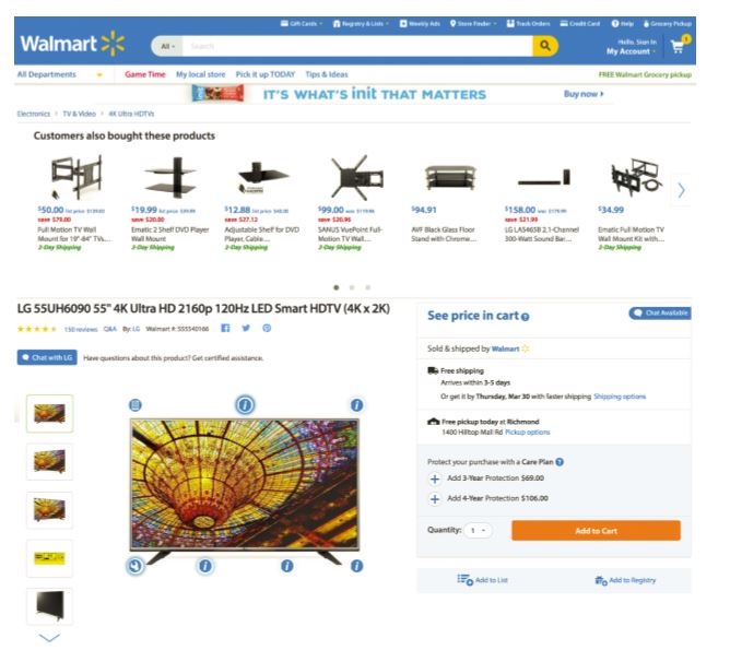
Because the customer previously viewed the products in the Recently Viewed Items placement, we expect some level of familiarity with their attributes (brand, price, etc.), so you can get away with just showing a product thumbnail—particularly helpful when you’re surfacing a deep browse history. Amazon.com does a great job with their personalized footer treatment seen below:

The personalized footer is designed to accelerate shopper navigation, thereby benefiting Conversion. However, given its location at the bottom of the page, their lower engagement can obfuscate reliable detection of Conversion lift. As such, we don’t consider these placements a great candidate for AB testing, particularly for retailers that have long pages on which customers rarely scroll to the bottom. If optimized, this should translate to an expected 0.5% RPV lift.
Recently Viewed Items
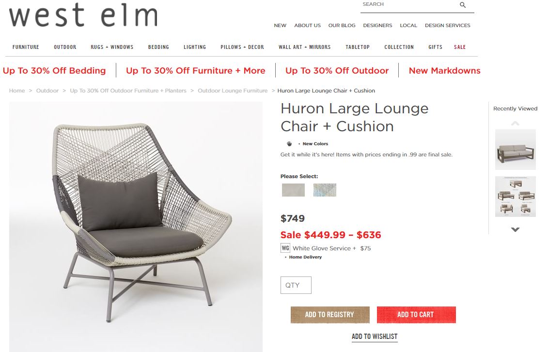
Rather than housing RVI in the personalized page footer, we can also slot it in the right margin of accommodating layouts. This is particularly useful on sites with deep levels of consideration—where customers evaluate a wide range of products (within a given sub-category) before purchasing. A highly visible RVI placement will make it easier for customers to navigate to and compare their previous considerations. Again, given the customer’s familiarity with these items, only showing the product image is sufficient—unless price plays a big part in a product’s appeal. West Elm provides a good example of this:

Like the personalized footer, the RVI placement is designed to accelerate customer navigation, thereby benefiting Conversion. We should not set expectations that it will produce material, measurable Conversion lift and mostly position this as a qualitative optimization that improves the shopping experience.
Conditional Cross-Sell
Some sites simply use a “mini-cart” and do not offer an add-to-cart experience (modal window or interstitial page) after a customer adds a product to their basket. This presents a missed opportunity to cross-sell against the item just added. We can work around this by displaying a conditional cross-sell placement that appears at the top of the page after a cart addition. As the name suggests, this presents complementary products (that is, from the ProductBoughtBought family).

For clients lacking an add-to-cart experience, a conditional cross-sell placement will generate AOV lift through an Items Per Order (IPO) increase. If optimized, we expect this to translate into 0.5% RPV lift (among customers that add an item to Cart).
Conditional Search Landing
This placement displays atop the Item and/or Category page when the shopper lands from external search (For example, Google or Bing). The intent is to engage the customer with a broader assortment of search-relevant products if the landing page content does not resonate. This tactic emerged from retailer desire to reduce the disappointing bounce rates of external search traffic—an inherent quality of that traffic stream. In testing, these placements reduce external search traffic bounce by 7-15%.
For Conditional Search Landing placements on the Item page, we use similar items and search strategies. On the Category page, we use category-based top sellers in addition to search strategies.

Conditional search landing placements are expected to reduce Bounce Rates of Item and/or Category page external search traffic by 8-15%.
Category-Diversity Placement
On Category pages, our preference is to recommend in-category products based on the customer’s browse and/or purchase history. In the absence of such history, we default to showing top sellers of some variety—the caveat being that his may have a bias for products residing within the largest categories. For broad top-level categories (or verticals), retailers sometimes want a diversity of products represented in Category page recommendations. For example, on the Men’s page, they’ll want to see a top-selling product from Jackets, Shirts, Pants, Shorts, and Accessories so that they’re providing sufficient subcategory exposure.
While none of our out-the-box strategies accomplish this objective, we can craftily use Advanced Merchandising to curate this experience. This requires instrumenting the Category page per usual except for adding the r3 call to pass in a dummy product (which must also exist in the feed) on the page. Once completed, Advanced Merchandising can key off of the dummy product and create category-slotted recommendations.
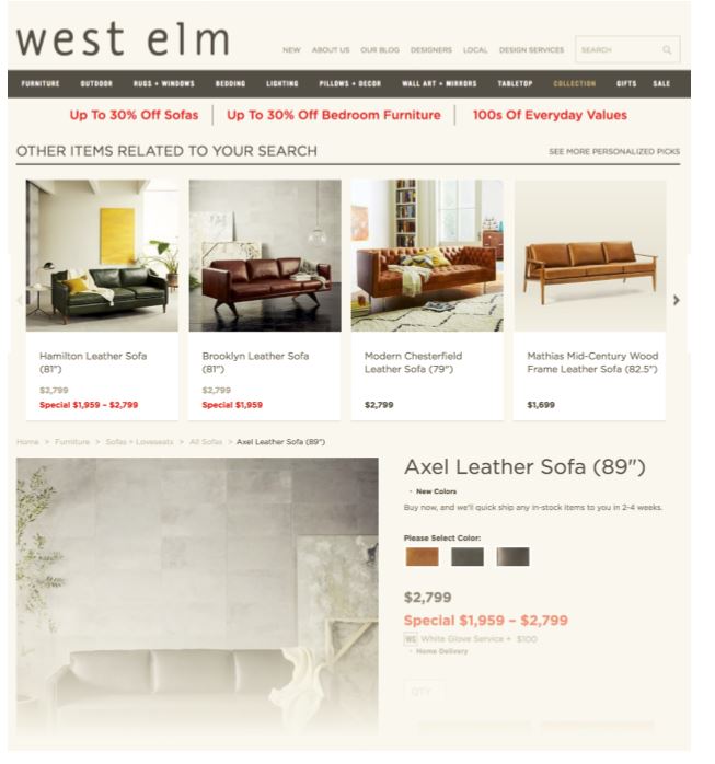
Note: This is the most effective for top-level categories under which exist a multitude of subcategories for where the retailer is looking for exposure. Below is an example:

Category diversity placements are a user experience play—more of a qualitative site improvement that does not target any specific metrics.